optuna-dashboard-blog
Level Up Your Hyperparameter Tuning with Optuna Dashboard: A Visual Guide for Movie Ratings Optimization
Introduction
As machine learning practitioners, we know that hyperparameter tuning can be a make-or-break factor in model performance. If you’ve used Optuna before, you already know it’s one of the most powerful tools out there for hyperparameter optimization. But there’s one Optuna feature that often flies under the radar: Optuna Dashboard.
Optuna Dashboard offers a visual, interactive way to monitor and manage your hyperparameter tuning studies. If you’re tired of sifting through raw logs and CSV files to track your experiments, Optuna Dashboard can be a game-changer. In this blog post, we’ll explore how to set up Optuna Dashboard to optimize a KNN-based recommendation system on a movie ratings dataset.
Why Use Optuna Dashboard?
Optuna Dashboard takes the core features of Optuna—like real-time optimization tracking and trial comparisons—and makes them visual and intuitive. Here’s why you should consider using it:
- Visualize Parameter Optimization: Get a clear, at-a-glance view of how different parameter choices affect your model.
- Easily Compare Trials: See the performance metrics of each trial, with options to sort and filter to find the best results.
- Track Progress: Watch how the objective function changes over trials, helping you decide when to stop or adjust your study.
- Enhanced Analysis: Use visual insights like parallel coordinate plots and parameter importance rankings to better understand relationships among parameters.
For anyone working with iterative experimentation or complex models, Optuna Dashboard provides an intuitive way to manage and understand the optimization process.
Step-by-Step Guide to Using Optuna Dashboard on Movie Ratings Data
In this guide, we’ll walk through setting up and using Optuna Dashboard to optimize a KNNWithMeans recommendation model on a movie ratings dataset. If you’re working with a different dataset or model, the steps are adaptable.
1. Setting Up the Environment
To start, make sure you have the required libraries installed. We’ll be using Optuna for optimization, the surprise library for the KNN model, and Pandas to manage our data.
pip install optuna scikit-surprise pandas optuna-dashboard
With these libraries installed, we’re ready to start coding!
2. Load and Explore the Data
For this tutorial, let’s assume you have a movie ratings dataset (movie_ratings.csv) with columns like user_id, movie_id, and rating. We’ll use the surprise library to load and structure this data for model training.
import pandas as pd
from surprise import Dataset, Reader

# Load the movie ratings dataset
df = pd.read_csv('/path/to/your/movie_ratings.csv')
reader = Reader(rating_scale=(1, 5))
data = Dataset.load_from_df(df[['user_id', 'movie_id', 'rating']], reader)
This code snippet loads the dataset and prepares it for the surprise library’s KNN-based models.
3. Setting Up the Objective Function for Hyperparameter Optimization
In Optuna, the objective function defines what we’re optimizing—in this case, the mean RMSE (Root Mean Square Error) of the KNNWithMeans model. Let’s set it up with some adjustable hyperparameters.
from surprise import KNNWithMeans
from surprise.model_selection import cross_validate
import optuna

def objective(trial):
    # Suggest values for hyperparameters
    k = trial.suggest_int('k', 10, 50)
    min_k = trial.suggest_int('min_k', 1, 5)
    sim_options = {
        'name': trial.suggest_categorical('similarity', ['cosine', 'pearson']),
        'user_based': trial.suggest_categorical('user_based', [True, False])
    }

    # Initialize KNNWithMeans with suggested hyperparameters
    algo = KNNWithMeans(k=k, min_k=min_k, sim_options=sim_options)

    # Perform cross-validation
    result = cross_validate(algo, data, measures=['RMSE'], cv=3, verbose=False)

    # Return mean RMSE
    return result['test_rmse'].mean()
Here, we’re using Optuna to suggest values for the k, min_k, and similarity parameters. Each trial in Optuna will generate a new combination of these parameters, run cross-validation, and return the mean RMSE for that trial.
4. Creating and Running the Study
Now, we create an Optuna study and run it. This will execute multiple trials, each trying different combinations of hyperparameters.
# Create a study with persistent storage
study = optuna.create_study(
    direction="minimize",
    storage="sqlite:///movie_recommendation_study.db",  # SQLite storage
    study_name="movie-recommendation-study",
    load_if_exists=True  # Load if the study already exists
)

# Run the study with the defined objective function
study.optimize(objective, n_trials=50)
This command starts the optimization process, which will run for 50 trials by default. If you’re looking for quick results, you can reduce the number of trials.
5. Launching Optuna Dashboard
Once the study is running, it’s time to launch Optuna Dashboard to visualize the tuning process.
Open a terminal and use the following command to start the dashboard:
# Start the dashboard
!optuna-dashboard sqlite:///movie_recommendation_study.db --port 8080
The output will print Listening on http://127.0.0.1:8080/ and you can open in your default browser to access it.
6. Exploring the Dashboard
Here’s a quick tour of the Optuna Dashboard’s features:
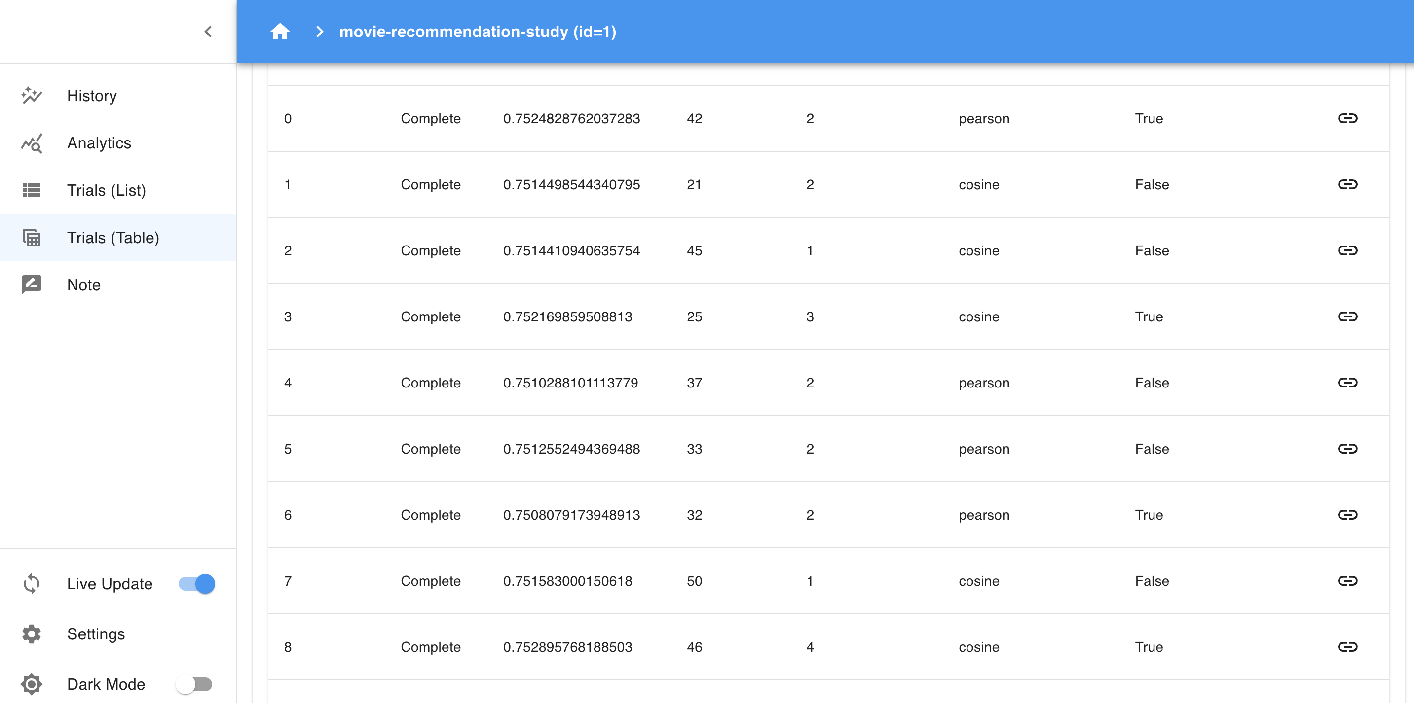
- Trials Table: This table displays each trial, showing the parameter values and objective values. You can sort, filter, and explore individual trials to find the best-performing ones.
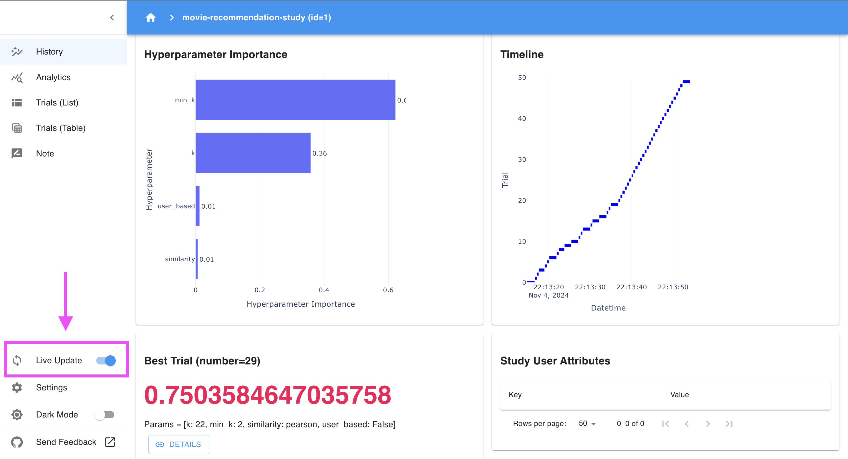
- Hyperparameter Importance: This section ranks hyperparameters by their impact on model performance, which is helpful for identifying the most influential parameters. If, for example,
min_kranks highest, it may have the biggest effect on RMSE.

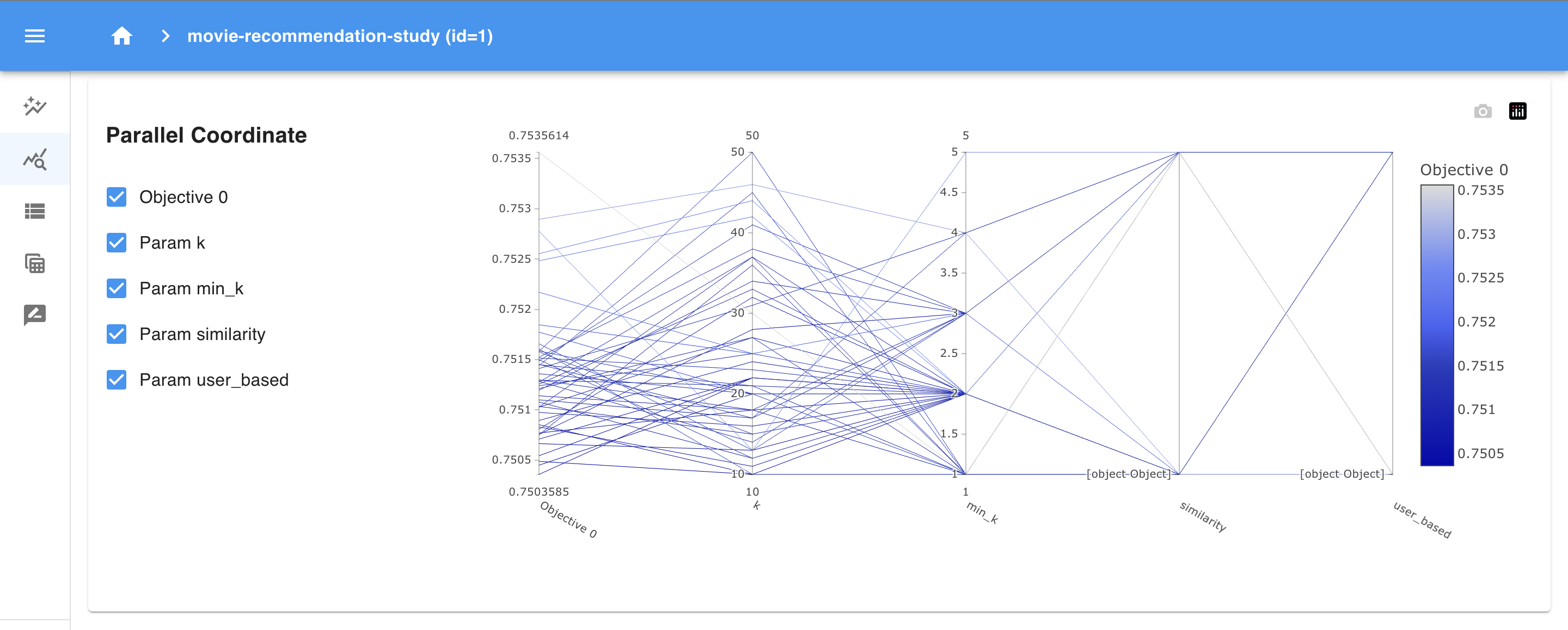
- Parallel Coordinates: This plot lets you explore relationships among multiple parameters. You can see how different combinations of
k,min_k, andsimilarityimpact the objective function, helping you spot potential interactions.
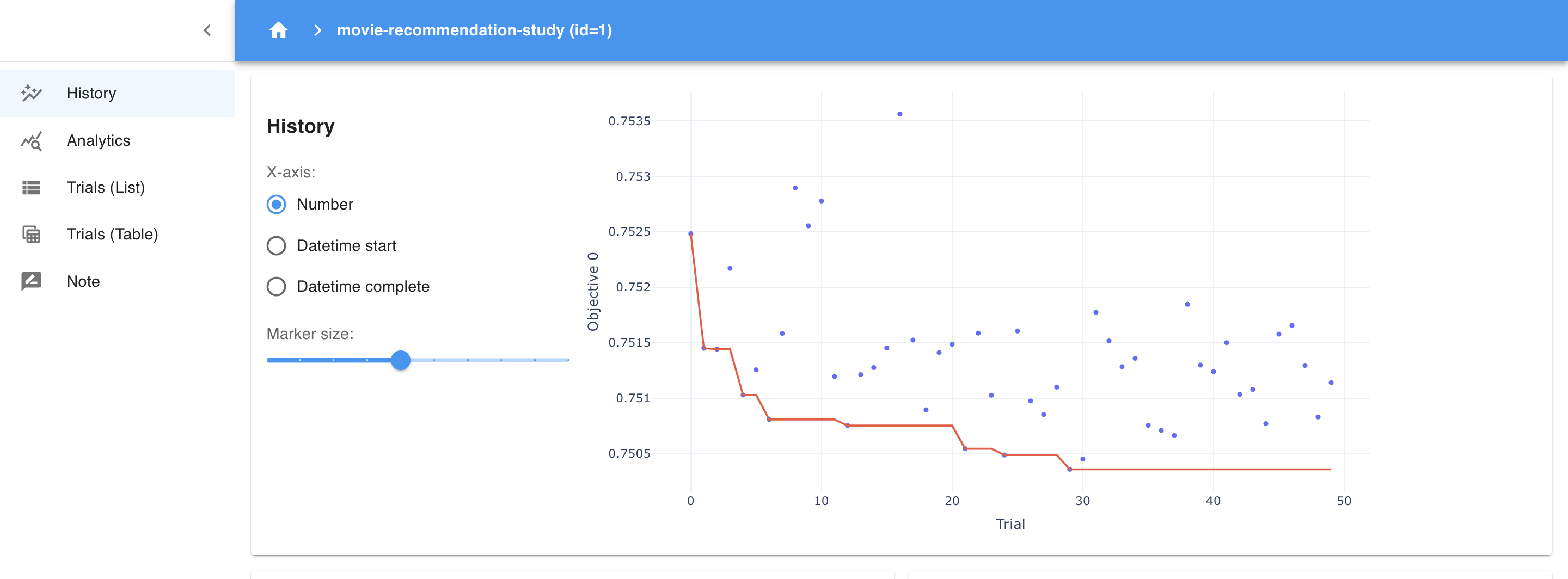
- History Plot: The history plot provides a visual timeline of the optimization process, showing how the objective (RMSE) has changed over the trials. Each point represents the performance of a trial, while the red line tracks the best RMSE achieved so far. This plot helps you see if the model is consistently improving and whether the optimization process is converging. A flat red line toward the end indicates that the model has likely found an optimal set of parameters, as recent trials aren’t yielding better results.
Each view offers powerful insights, and you can include screenshots of these sections to show readers exactly what to expect!
7. Finalizing and Saving the Best Parameters
After running your study, Optuna provides an easy way to access the best parameters and score.
best_trial = study.best_trial
print("Best RMSE: ", best_trial.value)
print("Best hyperparameters: ", best_trial.params)
Once you’ve identified the best parameters, you can integrate them into your model pipeline. Try running additional trials if you want to explore further, based on insights gained from the dashboard.
Why Optuna Dashboard is Better than Optuna’s Legacy Visualization Tools
Optuna has always provided visualization features to analyze optimization results, but before the dashboard was introduced, these were limited to static plots generated in a Jupyter Notebook or script. While these legacy visualizations (like optimization history, parameter importance, and parallel coordinate plots) were helpful, they had several limitations that Optuna Dashboard has resolved:
- Interactive Exploration:
- Legacy visualization tools produced static images, which meant you could only view a single set of results without real-time interaction.
- Optuna Dashboard, however, is fully interactive, allowing you to explore different views, filter trials, and zoom into specific sections. This interactivity gives you more flexibility to dive deep into results and find patterns that might be missed with static plots.
- Real-Time Monitoring:
-
The “Live Update” option in Optuna Dashboard provides real-time monitoring. When enabled, the dashboard will automatically refresh to show new trial results as they are completed. This feature is especially useful when running a long optimization process, as you can watch the performance of each trial as it finishes and see how the objective (in this case, RMSE) improves over time.
-
With Live Update enabled, Optuna Dashboard continuously updates plots like the History plot, Hyperparameter Importance, and other analytics sections. This allows you to monitor trends, identify early signs of convergence, and adjust parameters or stop the study if you achieve satisfactory results before all trials are completed.
-
- Comprehensive Comparison Across Trials:
- Legacy plots were useful for analyzing individual aspects of the study, but comparing trials across different parameter combinations was not intuitive.
- With Optuna Dashboard, you have a unified interface where you can compare all trials in one place. The Trials Table allows for easy sorting and filtering, while the Parallel Coordinates and Parameter Importance plots show relationships and the impact of each parameter on the objective function.
- Easier Workflow Integration:
- In Jupyter Notebooks, you often need to re-run cells or manage multiple plots to view different aspects of the study, which can be a hassle to maintain.
- Optuna Dashboard consolidates all the information in a single interface, making it easier to integrate into your workflow. You simply start the dashboard, and all insights are accessible in one place without extra coding or re-running cells.
Limitations of Optuna Dashboard
While Optuna Dashboard is a powerful tool for monitoring and analyzing hyperparameter optimization studies, it does come with certain limitations:
- Limited Customization of Visualizations:
- The dashboard offers useful built-in visualizations, like parallel coordinate plots and history graphs, but customization options are limited. Users cannot easily adjust colors, styles, or chart types, which may make it challenging to tailor the visuals for specific presentation needs.
- Scalability Issues with Large-Scale Studies:
- When dealing with studies containing a large number of trials (e.g., thousands or more), the dashboard can become slow or laggy, especially in the parallel coordinates and history plots. This can make it challenging to use for very extensive or high-dimensional studies.
- No Built-In Export or Report Generation:
- Optuna Dashboard does not offer options for exporting visualizations or generating reports directly. Users who want to save the results or include charts in external reports need to rely on screenshots or use Optuna’s Python-based visualization functions in Jupyter Notebook for more customized output.
Conclusion
Optuna Dashboard bridges the gap between complex hyperparameter tuning and intuitive insights. By visualizing the optimization process, it enables practitioners of all levels to analyze their models in real time. Give Optuna Dashboard a try on your next project, and see how it can help you unlock new levels of model performance.
With this guide, you now have the tools to use Optuna Dashboard effectively. Take advantage of its visualization capabilities to gain deeper insights into your experiments. And remember, a picture is worth a thousand words—add screenshots to your blog post to showcase Optuna Dashboard’s features in action.